
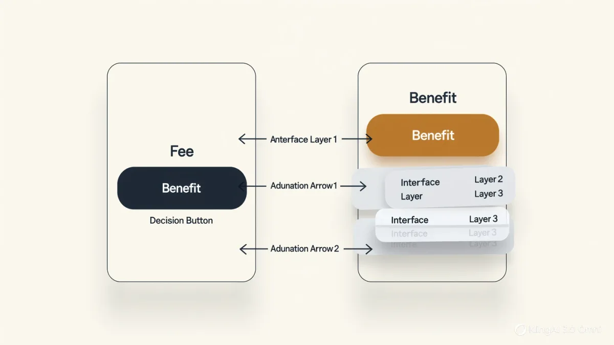
Federal consumer-protection law reaches the design of digital interfaces directly: the CFPB's Circular 2022-07 told the industry that dark patterns — design choices that steer, obscure, or manipulate — can themselves constitute unfair, deceptive, or abusive acts and practices, and the FTC's deception doctrine had already reached interface claims and buried disclosures through decades of enforcement. For a fintech app, the consequence is architectural: the disclosure is the journey, and a technically accurate statement delivered through a design engineered to defeat comprehension reads to a regulator as the conduct, not the disclosure.
3G Times publishes information, not legal advice. UDAAP exposure is fact-specific and exam-enforced; journey design should be reviewed with consumer-protection counsel.
What counts as a dark pattern in a finance app?
The taxonomy is stable across supervisory statements and enforcement. Obstruction: cancellation or dispute flows buried under layers designed to exhaust — the harder it is to leave or complain than to buy, the more the friction reads as intent. Visual prominence inversion: the fee disclosed in gray six-point type while the benefit rides in a hero banner — prominence, not mere presence, is the disclosure standard's operative word. Confusing choice architecture: pre-selected options, double negatives, and toggle designs where the expensive default hides behind neutral labels. Forced continuity and drip pricing: trials converting silently, fees appearing across the journey rather than at decision points — the junk-fees era's central fact patterns. Guilt and misdirection: emotional pressure in decline flows, "are you sure" cascades, and confirmshaming. None of these require falsehood; that is precisely the point — UDAAP's design lens prices what the interface did to the consumer's choice.
How do examiners actually test a journey?
By walking it as a consumer would, with the marketing adjacent to it. The exam technique that has become standard: take the ad or the app-store promise, then trace the actual path to the fee, the cancellation, or the dispute — counting screens, measuring prominence, noting defaults. The findings language follows the design vocabulary: "the disclosure was accessible but not prominent," "the cancellation flow required six interactions and two retention offers," "the advertised price excluded a fee disclosed after account creation." Programs get ahead of this by running the same walk themselves — a documented journey audit with screenshots at each decision point, scored against the prominence and comprehension standards, is both the remediation map and the exam exhibit.
| Journey element | UDAAP-safe pattern | Enforcement pattern |
|---|---|---|
| Fee presentation | Representative, prominent, at decision point | Drip disclosure post-commitment |
| Cancellation | Symmetric with signup effort | Buried flows, retention gauntlets |
| Defaults | Neutral, clearly labeled | Expensive pre-selections |
| Decline paths | Respectful single confirm | Confirmshaming cascades |
| Marketing-to-app match | Promise equals experience | Ad claims the journey contradicts |
What does a disclosure architecture look like that survives?
It starts from a principle the supervision has effectively adopted: material information travels at the moment of decision, at the consumer's attention level. Concretely: costs consolidated at the point of choice rather than distributed to where they are least read; the cancellation path discoverable from the same surface where signup lives, with effort proportional to acquisition; defaults chosen as a compliance decision with sign-off, not a growth-metric artifact; A/B tests reviewed for UDAAP exposure before they ship — because a test that optimizes comprehension downward is a documented intent evidence problem, and the experiment logs are discoverable. The mature program treats each dark-pattern risk with the same machinery as any other control: a named owner, a review gate in the design system, and periodic journey audits with findings tracked to closure.
Why is the abusive prong the design-era's sharp edge?
Because abusiveness reaches conduct that takes unreasonable advantage even without deception — and interface leverage over a consumer's understanding is its native fact pattern. A flow that exploits a consumer's inability to protect their interests — cognitive load engineered at the decision moment, urgency timers on financial commitments, complexity that obscures the total cost — presents the abusive analysis squarely, and the Bureau's usage has increasingly done so. The design team's defense is not that the consumer could have read carefully; it is that the journey was engineered for comprehension, evidenced by the audit trail, the prominence discipline, and the A/B logs that optimized for understanding rather than against it.
What does this mean in practice?
- Run the documented journey audit quarterly — screenshots at every decision point, scored for prominence, effort symmetry, and marketing match; it is simultaneously remediation and defense exhibit.
- Gate design-system changes like rate changes: defaults, friction, and prominence patterns ship through compliance review, not just brand review.
- Review experiments for design risk: the test that increases conversion by decreasing comprehension is the era's defining enforcement artifact.
- Match the funnel to the ad spend: the journey audit's first input is what marketing said, because the mismatch is where UDAAP cases begin.
The industry's first decade of app design optimized for engagement under consumer-law silence; the supervision caught up, and its vocabulary is now the designer's. The fintechs that internalized prominence, symmetry, and comprehension as product requirements ship journeys that convert honestly — and sleep through the exam that walks them.
The synthesis for design leadership: the supervision has effectively converted interface design into a disclosure discipline, and the teams that internalized it stopped treating compliance as the review at the end of the funnel and started treating it as the spec at the beginning. The journey that ships clean is designed clean — the audit finds nothing because the design gate already did, and the conversion dashboard stops being the only scoreboard anyone defends.
What about personalization?
Personalized pricing and offers are the design-era's frontier: the same journey architecture that discloses a fee prominently must disclose that others see different prices, where materiality requires it. Programs that treat personalization as a disclosure event — logged, variant-evidenced, prominence-checked — extend the audit they already run; the ones that treat it as pure growth inherit the experiment-log problem at scale.
Frequently asked questions
A closing observation on trajectory: the junk-fee agenda, the click-to-cancellations, and the dark-pattern circulars are converging on a single principle — the exit door must be as well-lit as the entrance. Design teams that adopt that symmetry as an aesthetic, not a constraint, find that it survives every supervisory turn; the ones that litigate each new pattern learn it one consent order at a time.
Is any friction in cancellation illegal?
No — verification, a single retention offer, and survey questions within reason all appear in accepted flows. The supervision's line is proportionality and intent: effort wildly asymmetric with signup, or friction engineered to defeat the choice, is the pattern priced as unfair.
Do A/B tests create legal exposure?
They create evidence. Tests optimizing comprehension or task success are defensible artifacts; tests that measure whether making a fee less prominent increases conversion produce documents no defense wants to explain. The review gate exists to keep experimentation on the right side of that line.
What is the fastest self-audit a small team can run?
The walk-through: one reviewer, one fresh account, screenshots from ad-click to cancellation, scored on three questions — was every material fact prominent at its decision point, was leaving as easy as joining, did the app do what the ad said. Thirty minutes, repeated monthly, catches most of what exams find.
For more context, read Micro-Disclosure Evidence: Proving What the App Actually Showed, Screen by Screen.
For more context, read banking chatbot compliance udaap.
For more context, read alternative app distribution fintech.